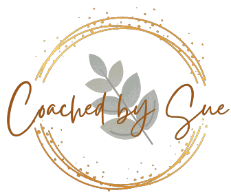
Coached by Sue Logo - Explained
The symbolism of the logo holds the client at the center of the relationship
When creating my Coached by Sue Logo I wanted you the client to see you were the focus of everything from the moment you looked me up and found me. It was crucial to me that you as the client realized that the coaching relationship is all about you. In our relationship you are provided a safe space to share your story and talk about the parts of you that you want to do differently. All of my experience and skills has come to this point where I will focus on asking you questions about you and the 'WHY' you do 'WHAT' you do. As we continue the relationship you are given more space to find your solutions for your change in your life on your terms that work for you. I can offer you advice along the way BUT I can only offer this advice once you have consented to accept it.
I was challenged to create my logo as I wanted strong symbolism that kept me firmly grounded to the purpose of my business creation. Therefore I started with the focus of my business. You the Client! To me the client is the focus and purpose of my work. Clients are human, complex, strong, resilient and in thinking on this a Eucalypt/ (Karri - Aboriginal language) tree came to mind. That is where my logo commenced and the eucalypt/Karri leaves at the center of the logo is the client. A eucalypt/karri is evergreen, strong, resilient and able to weather all complexities thrown at it. It is an ancient presence and forever green and growing, replenishing itself. This is all of us as humans and our potential if we know our strengths and how to believe in them and use them within ourselves. This is you the client.
The circle and dot elements was the next aspect created. The circle line and dot elements continually spin around the karri/eucalypt and symbolizes the flow and spirit of conversation and dialogue that occurs in the coaching relationship. For the dialogue to be client centered, the communication keeps flowing between the coach and client and is focused on the client as the client and coach bring their spirit and strengths to that dialogue. The flow of communication allows the client to feel safe as the spirit elements symbolize the challenge to growth that the client will encounter as they experiment at making change to achieve the vision they have for themself.
The final aspect of the logo is my business name as coach flowing through and connecting with all parts of the client, the dialogue lines and the spirit. This holds me true to myself of why I started this business. I started this business to support people to find their peace in their best self on their terms that is all about them. In life now we are often caught up with what we 'should' do or we are lost because we are focused on what others think and say around us and about us - but we are ancient and evergreen and can choose our paths and our journeys.
I know I have helped many start on their new paths of their lives. I have supported people to develop their inner strength to know they can keep changing their paths on their terms to align with their strengths as they keep evolving. I am passionate about what I do and value you as a client in wanting the change of direction you want to have for your life on your terms. I created this business for you.